Understanding Calligraphy Guidelines & Typography
Ascender line? X-height? Capline? Calligraphy guidelines? If you’ve spent any amount of time around calligraphy, you’ve probably seen these terms. But what do they mean? And how important are they to modern calligraphy?
In this guide, we’ll explain everything you need to know about calligraphy guidelines and typography as it relates to calligraphy. We’ll cover the different types of calligraphy lines and typography lines in the lettering world, how those lines are used in modern calligraphy, and why they’re important.
Tap to jump to a topic:
4 Types of Calligraphy Lines
What are calligraphy lines? What do we actually mean when we talk about calligraphy lines and how they work within modern hand-lettering? The fact is, the term “calligraphy lines” can actually refer to four different things. Let’s look at those now, and agree on which one we’re discussing in this guide.
1. Decorative Flourishes in Calligraphy

The first type of calligraphy line is the decorative flourish. These lines are ink-drawn lines that are used to embellish a piece of text. Think of an invitation to a fancy event or the title of an old book – it could even be a regular hand-lettered piece of word art – these calligraphy lines are placed above, below, or around the text to dress it up. They can even be an extension of the letters.
Decorative calligraphy lines can be monolines or brush lines. They can be long and flat or more compact. They can have curlicues, twists, switchbacks, waves, and even ornaments, such as little arrows or spades at the ends of the lines. A calligraphy line in this sense can be oriented right, left, or balanced.
2. Slanted Calligraphy Lines

In calligraphy and particularly traditional calligraphy, slanted lines are used to guide the angle of the letters and words on the page. Picture a grid with horizontal and vertical lines, like a sheet of graph paper. However, imagine the vertical lines are all tilted forward at an angle of about 20 degrees. This is what slanted calligraphy lines are. Their purpose is to give the calligrapher a reference as he or she crafts each letter, and the final result is not unlike italicized font, with all of the letters pitched forward at the same angle.
3. Calligraphy Strokes

Another type of calligraphy lines is calligraphy strokes. Sometimes calligraphers refer to the eight basic lettering strokes as calligraphy lines. The idea is that these basic strokes form the building blocks of all calligraphy letters. They include the upstroke, downstroke, overturn, underturn, ascending loop, descending loop, compound curve, and oval. Every letter from A to Z can be broken down into a combination of one or more of these strokes, such as…
The lowercase letter h = ascending loop + compound curve
Or
The letter K (both upper and lowercase) = downstroke + descending loop
Or
The letter U = underturn + underturn
To learn more, check out our complete guide to the eight basic strokes of calligraphy.
4. Typography Lines

Lines in calligraphy can also refer to typography lines or calligraphy guidelines. Like the slanted lines, typography lines for calligraphy are designed to help guide the movements of the artist’s pen. However, instead of being gridlines, typography lines are all about height; that is, the height of a letter at its various components.
Sometimes referred to as typeface lines, typography guidelines anchor each calligraphy letter to the page, ensuring that the words maintain a consistent bottom line. They tell the artist how tall each letter should be, whether it’s a capital letter or lowercase. They also serve as a reference point when crossing your Ts, dotting your Is, and making beautiful flourishes to accent your letters.
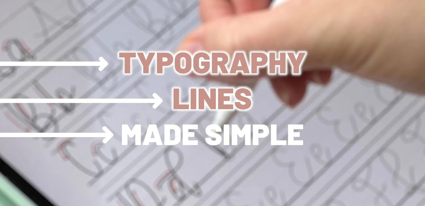
Defining Typography Lines for Calligraphy
As we discuss calligraphy guidelines, we’re talking about typography lines. But what are typography lines? Remember back in grade school when you were learning how to write for the first time? Remember the lined paper that your teacher used with horizonal lines across the page? Some were black, others were blue. Some were solid, others dotted.
Typography lines aren’t much different. They’re thin lines on a page that run horizontally and are generally repeated in a specific pattern. Some of the lines are black or dark grey, others are blue, some are solid, some are thicker, others are dotted. Just like that lined piece of paper from grade school, typography lines are there to help you as you’re learning calligraphy. Their purpose is to be guardrails that signal different facets of your letter, specifically the height or depth of those facets and where certain lines ought to intersect.
In typography, there are five key lines or heights. From top to bottom, these lines are the ascender line, the capital height, the X-height, the baseline, and the descender line. More on this in a bit.

Are Guidelines Really Needed in Modern Calligraphy?
As we’ve already mentioned, traditional calligraphy uses the slanted lines to craft very uniform letters. And in fact, typography guidelines are used as well. But are these guidelines relevant for modern calligraphy? After all, it’s modern art, right? There are no rules!
Wrong! Typography lines are an important part of modern calligraphy and need to be understood for the modern calligrapher to be a successful artist. Why? Because when people look at your work, you want them to feel a sense of intentional beauty. You want your work to draw in the eye and captivate the attention with a certain agreeableness that makes logical sense to the unconscious brain.
Think of it this way: have you ever watched a movie or read a book where the plot kept shifting, the characters felt flat, and the ending left you unsatisfied in its resolution? That’s what lettering is like when typography is completely ignored. It’s nonsense unleashed on the calligraphy world.
How Much Are Calligraphy Guidelines Actually Used?
If calligraphy guidelines are so important, why don’t you see them in finished pieces, on Instagram posts, in window displays, etc.? How much does the modern calligrapher actually use typography lines?
The purpose of typography guidelines in calligraphy is all about learning. If you’re developing your calligraphy skills for the first time or sharpening your existing skills with a certain letter, or learning a new calligraphy font to broaden your skillset, guidelines are vital. They act like a set of training wheels for your lettering. They provide an anchor point for where to begin each letter, serve as signposts for guiding your strokes, and keep your letters from spiraling wildly out of control. They also help you achieve that coveted X-factor in calligraphy: consistency.

Once you’ve learned an alphabet or perfected a particularly tricky letter or if you’re simply doodling freehand, then you can leave the typography lines behind. They’re not always needed, but they’re not just for beginners either. For many calligraphers, typography lines become less and less prevalent in their daily lettering routine, but oftentimes, they never disappear entirely. In fact, if you’re working on a piece that requires a higher degree of consistency, you can use just a baseline (more on this shortly) to give your words that anchoring point.
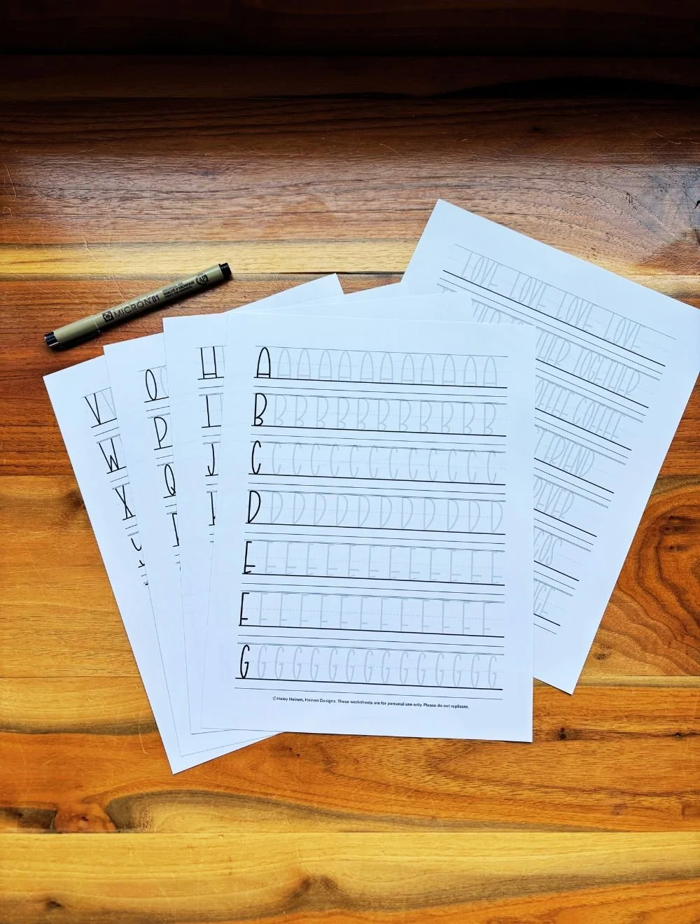
5 Typography Guidelines to Know for Calligraphy
There are five different lines in typography that you should know as they pertain to calligraphy. Typography is a much broader topic that spills over into the world of fonts, typeface, printed text, and graphic design. However, it’s important for hand-lettering too. Here are the five typography guidelines to understand for calligraphy.

This line marks the very tallest point for an alphabet. Generally, letters don’t extend above the ascender line.
The capital height marks the top of your capital letters, as well as the height of some lowercase letters.
The X-height marks the midway point or roughly half the height of your capital letters and the top of many lowercase letters.
The baseline is the bottom, the foundation of all letters. It provides an anchor point on which all letters rest.
This line marks the very lowest point for an alphabet. Generally, letters never dip below the descender line.
1. Ascender Line
Appearance: Thin, solid black line
Position: Very top, just above the capital height
Purpose: Marks where ascender strokes touch
Frequency of Use: Rare
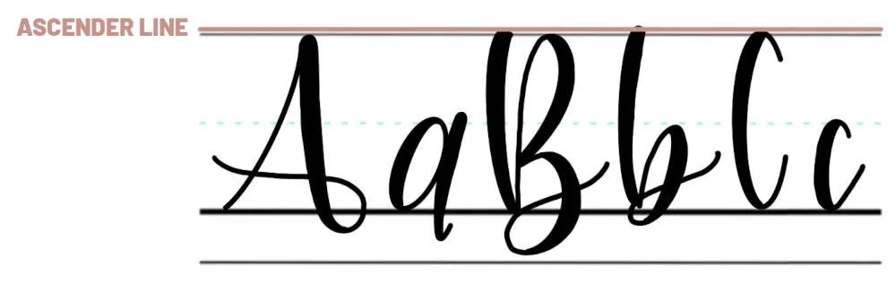
The ascender line is the highest point in your calligraphy alphabet. This line is at the top of the typography order and sits just above the capital height. The official purpose of the ascender line is to mark where the ascenders reach to. What is an ascender? An ascender is the portion of a lettering stroke that reaches above the main portion of the letter.
Which Letters Use the Ascender Line?
Out of all the typography guidelines in calligraphy, the ascender line is used the least, or second to least. This is because most letters occupy the space between the baseline and the capital height.
Some of the letters that use the ascender line: lowercase b, lowercase d, and lowercase h.
2. Capital Height
Appearance: Thin, solid black line
Position: Second from the top, below ascender
Purpose: Marks the uppercase letter height
Frequency of Use: Common

The capital height line or capline in calligraphy is the standard height of your capital letters. This line marks how tall your uppercase letters should be but also provides a reference point for some lowercase letters. The capital height falls just below the ascender line.
Which Letters Use the Capital Height?
As you might guess, all capital letters in the calligraphy alphabet use the capital height; that is, their top strokes reach up to the capital height. From capital A down to capital Z, at some point the lines of every letter touch the capline.
For lowercase letters, the capital height is used less frequently. However, there are some lowercase letters with particularly tall strokes that touch the capital height. These include the lowercase b, d, f, h, k, l, and t.
3. X-Height
Appearance: Thin, dotted blue line
Position: Center, equidistant between capital height and baseline
Purpose: Marks the middle of uppercase letters and top of many lowercase
Frequency of Use: Very common

The X-height (also known as the “waistline”) is the center point of the typography landscape. It rests at an equal distance between the baseline at the bottom and the capital height line at the top. The X-height is a fairly unique line from the others as it is classically marked with a dotted blue line instead of solid black.
The primary purpose of the X-height is to mark the top of the lowercase alphabet, or at least, the top of the main stroke of most lowercase letters. Think of a lowercase a and lowercase b. Both of these letters have an oval stroke, making up the main portion of the letter. Even though the letter b has an ascender that reaches far above the height of the letter a, the height of the oval in each letter is the same. This is the X-height. It’s the measuring line for most lowercase letters, and it marks the center point, the hinge, for many uppercase letters.
Which Letters Use the X-Height?
All lowercase letters use the X-height to mark the top of their primary stroke, with the exceptions of the lowercase letters f, l, and t. All capital letters use the X-height as well, at least in come capacity. Some use it as a key reference point for specific strokes. These include the uppercase letters E, F, G, I, L, P, W, and X.
Others still reference the X-height for certain strokes, but only as a certain halfway point or partial distance measurement. For example, the uppercase letter B intersects itself about halfway between the X-height and baseline. Without the X-height as a marker, this intersection would be much more difficult to estimate.
Finally, some capital letters only use the X-height line in that their strokes pass through it on the way up to the capital height or down to the baseline.
4. Baseline
Appearance: Thick, solid black line
Position: Bottom, but above descender line
Purpose: Marks the bottom point of all letters
Frequency of Use: Most common
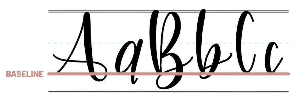
Every letter in the calligraphy alphabet uses the baseline. This line serves as the bottom, foundational point on which all letters rest. If you were writing a sentence on a blank piece of paper and you wanted the words to be in a straight line, you could start by taking a ruler and drawing a line across the page with your pencil. This would serve as your guideline, and you would write each word on top of this line. This is what the baseline is in typography. For this reason, the baseline is a thicker black line, solid, running across the row.
Which Letters Use the Baseline?
All letters use the baseline in calligraphy, each one being “set” on top of it, like books on a shelf. True, the letters with descenders drop down below the baseline (reaching to the descender line), but their primary stroke stays above.
Additionally, there are some letters that flex the rules of the baseline. These letters still sit on top of the line as part of the “straight row” of your word or phrase or sentence, but they have less clear facets that pivot on the line. These letters include uppercase H, J, and Y, as well as the lowercase j and l.
Take the capital letter J for example. It starts at the capital height line and drops all the way down to the descender line before looping back up and around. The loop wraps around the baseline, using it as a midway point, but the stroke doesn’t stop anywhere along the baseline.
5. Descender Line
Appearance: Thin, solid black line
Position: Very bottom, below baseline
Purpose: Marks where descender strokes reach
Frequency of Use: Uncommon

The descender line is at the very bottom of the typography chart. If you were building a house and the main floor was the baseline, the descender line would be the basement. The descender line is meant to mark where your descender strokes should reach to; that is, strokes that come off the primary stroke of the letter and drop down below it. The descender line is thin and solid black, just like the ascender line and capital height line.
Which Letters Use the Descender Line?
Like the ascender line, the descender line is used less often compared to the others. However, it’s not as rare to use the ascender. About nine different letters have descender strokes that reference this lowliest of typography lines: lowercase g, uppercase H, I, and J, lowercase j, lowercase p, q, y, and z. You could argue that other letters reference the descender line as well, but that becomes something of a matter of style and opinion, which we will unpack next.
Bending the Rules of Typography
Typography lines in calligraphy, at least in modern calligraphy, are not hard and fast rules that must be obeyed. As we’ve said many times, they’re meant to be guidelines, bumper rails, navigational buoys that encourage you in the right direction.
When you’re first learning calligraphy, you should stick to the guidelines. They’ll help you develop your core skills, setting you up to succeed as a calligraphy artist and be more versatile later on. However, after you’ve developed that foundation, bending the rules of typography can become a regular part of your hand-lettering routine. In fact, this is one of the best ways to develop your own style and ultimately your own signature calligraphy alphabet.
Here’s an example. The letter K is comprised of a downstroke and a descending loop. According to the strict rules of typography, the downstroke should extend from the capline all the way down to the baseline. Likewise, the descending loop should go from capline to baseline, taking a slight detour in the middle to create the loop. But what if the descending loop didn’t reach its destination? What if, instead of bringing the stroke all the way down to the baseline, you let it trail off and hover above the baseline? Maybe you try this, and you really like it. You test a few different iterations until you land on a version that you consistently love. Guess what – you just developed your own version of the letter K!

Adjusting Typography Measurements
Another way to bend the rules of typography to achieve new and exciting results is to adjust the measurements between the lines. The five calligraphy guidelines listed above – ascender line, capital height, X-height, baseline, and descender line – they serve as guardrails for your strokes. But what if you moved the guardrails?
Interesting things begin to happen when you shift typography lines around. Drastic shifts aren’t always the best idea, but small adjustments can make a big difference, and soon new font styles begin to take shape.
For example, you could move the X-height within your typography framework down half a step. This would move every stroke that uses the X-height as a reference point down, including most of your lowercase letters. You could also move the X-height up, increasing the distance between baseline and X-height, having an opposite effect.
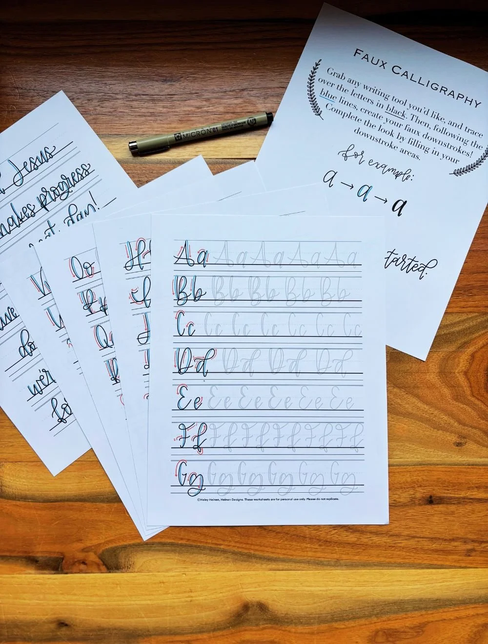
Putting Calligraphy Lines to Use
Now that we’ve described the position and purpose of each typography guideline in calligraphy, let’s walk through a quick example of how you would use them in real hand-lettering.
We’ll use the word love for our example, l-o-v-e, and we’ll letter it in all lowercase. In this example, we’ll reference a number of different strokes, such as ascending loop, oval, and overturn. If you’re unfamiliar with these terms, be sure to check out our guide to the basic strokes of calligraphy.
1. Lowercase l
1/2 X-height > capital height > baseline > X-height
To make the first letter, the lowercase l, begin your first stroke about halfway between the baseline and the X-height. Make an ascending loop that reaches up to the capital height and then comes back down to intersect at the X-height before it reaches the baseline. Finally, shift the stroke into an underturn, bringing the line back up to just below the X-height.

2. Lowercase o
X-height > baseline > X-height
Next, start into the lowercase o. Begin at the X-height and make a counterclockwise oval. You can bring the oval all the way down to the baseline or leave it suspended, like you see in the example. Complete the oval by wrapping the stroke around on itself and finishing just below the X-height.

3. Lowercase v
X-height > baseline > 1/2 capital height > X-height
Now make the lowercase letter v by starting where the o left off, at the X-height. Make a downstroke to the baseline. Then, make an upstroke that shifts into an overturn as it passes through the X-height. The overturn should peak about halfway between the X-height and capital height. Conclude by bringing the stroke down again, ending just above the X-height.

4. Lowercase e
1/2 X-height > X-height > baseline
Finally, to make the lowercase e in the word love, make an ascending loop, starting the stroke about halfway between the baseline and X-height. Bring the line up to the X-height as it loops around counterclockwise. Drop down to the baseline and continue to curl around, ending the stroke just above the baseline.

As you can see, the number of times your typography lines are used as a reference point is substantial. Notice how the ascender line and descender line were not used at all in this example, but the other three were used heavily.
As you go about learning calligraphy, these reference points will become more and more like muscle memory than something you’ll need to consciously think about. Your skills will grow, and soon you’ll be gliding through each stroke knowing exactly where your lines ought to intersect the typography lines. Before long, you won’t even need the typography lines at all.
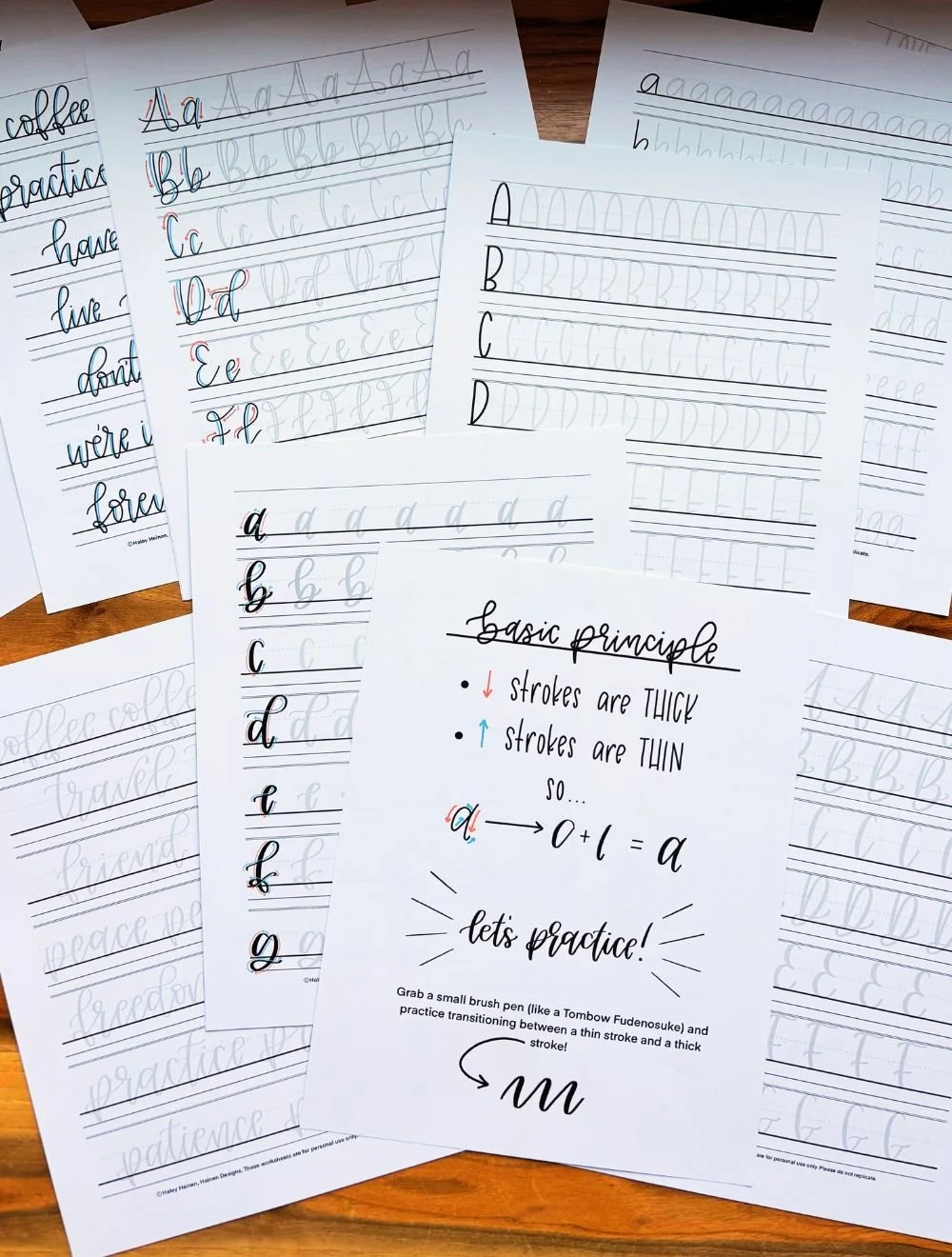
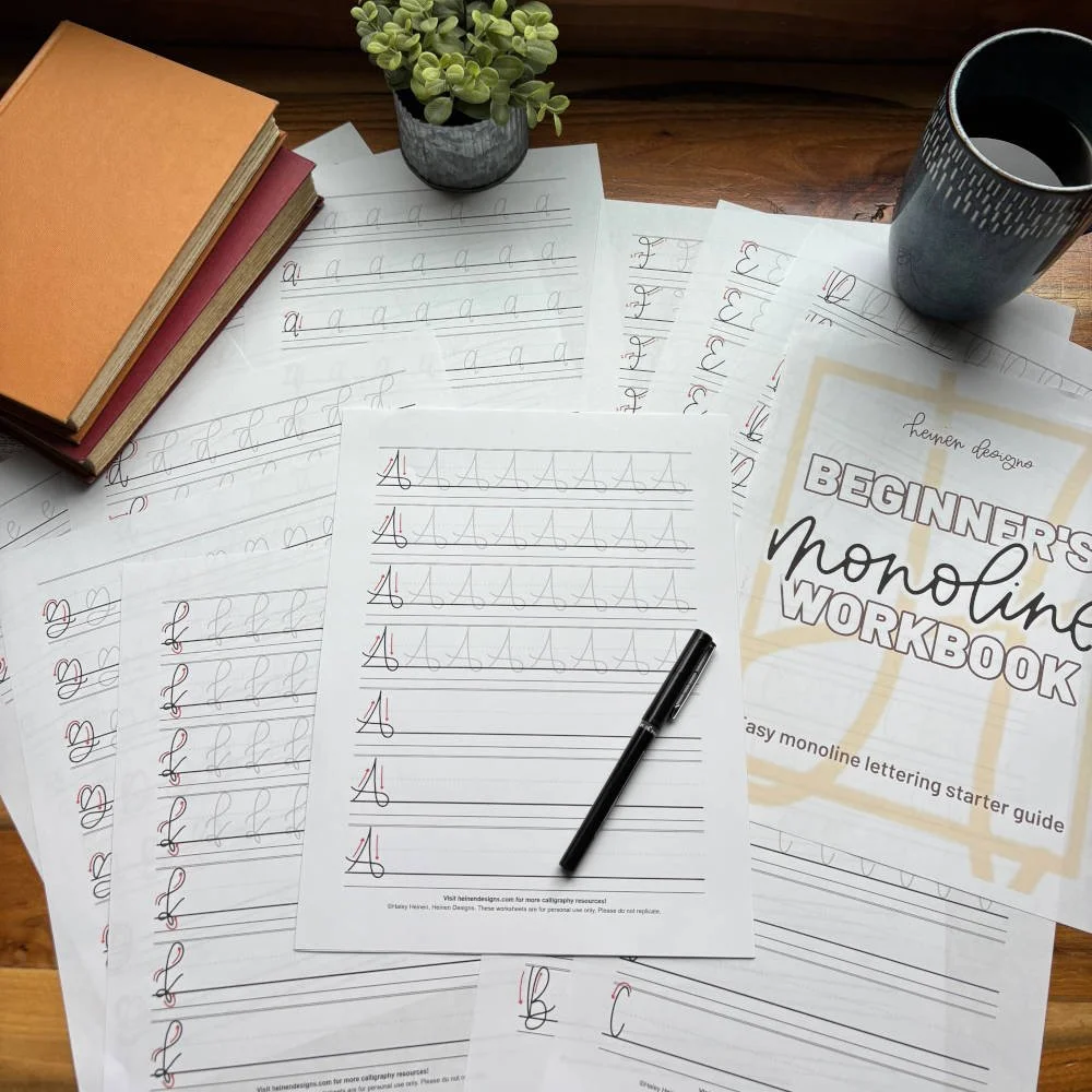
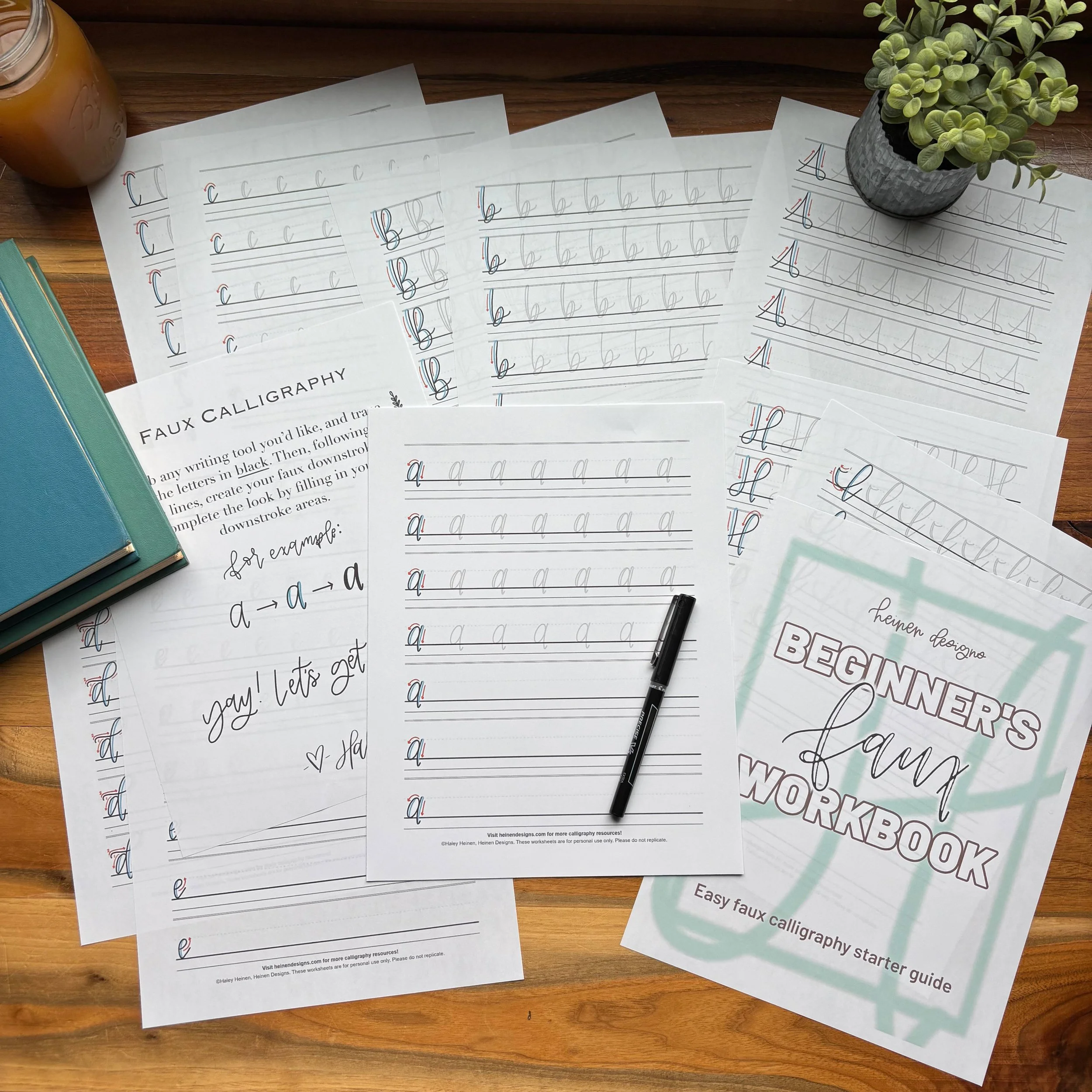
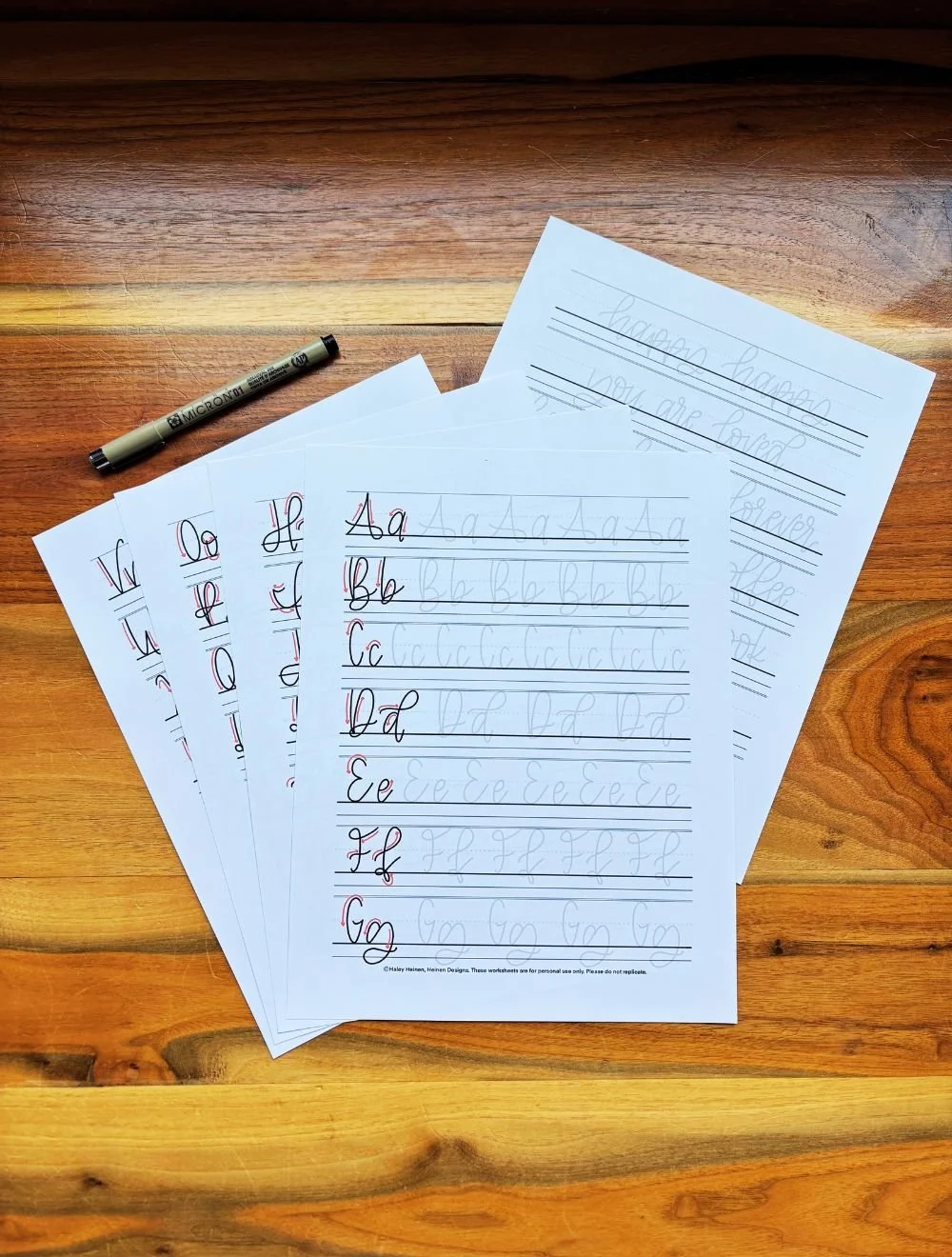
Taking the Next Step
If you’d like to grow your calligraphy skills, the next step is easier than you think. The best way is to start with a practice sheet. A practice sheet provides a traceable calligraphy alphabet that you can print off or use digitally to start building your muscle memory as a hand-letterer. Best of all, practice sheets come with typography lines, so you can start applying the things you’ve learned in this guide right now!