The Ultimate Guide to Faux Calligraphy
Friend or faux? Guess what – we can do both! If you’re looking for help with faux calligraphy, you’ve come to the right place. Faux lettering is one of the most fun and diverse font styles in modern calligraphy. It can range from elegant, to playful, to downright silly – all using the same basic lettering structure.
In this ultimate guide to faux calligraphy, we’ll define exactly what faux means and how it compares to other lettering styles. We’ll talk about the best pens (and pencils!) to use for faux. We’ll explain best practices for crafting faux letters, and finally we’ll explore ideas for faux patterns.
Be sure to download the free faux calligraphy worksheet to try your hand at faux letters!
Tap to jump to a topic below:
What is Faux Calligraphy?
Faux calligraphy is a style of modern calligraphy that mimics the look of brush lettering using a monoline pen. The letters are crafted using simple monoline techniques, but they are made in such a way that they appear to be crafted with a brush pen.
Oftentimes, faux letters are seen with bubbles or open spaces weaved into the strokes, particularly the vertical downstrokes. The bubbles can be filled in with solid black, decorated with lines or dots, or they can be left open.
The classic form of faux calligraphy follows the cursive style of brush lettering – sweeping, flowing strokes that connect into one another as they form each word. However, faux calligraphy can take other forms as well, including print fonts and other non-cursive styles.
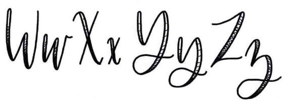
Here’s an example of the faux calligraphy alphabet:
Why is it Called “Faux”?
The word “faux” literally means “false.” That means “faux calligraphy” translates to “false calligraphy.” It is called “false” calligraphy because of its fabricated brush-lettered look – monoline under the guise of brush letters.
But there’s really nothing truly deceptive or malicious about faux calligraphy. In fact, faux calligraphy in its most basic form isn’t really monoline lettering or brush lettering. It takes on a personality of its own, becoming its own modern calligraphy style and serving as a wonderful tool in the modern lettering artist’s toolkit.
Examples of Faux Lettering
The words “faux calligraphy” written in classic faux style with extra downstrokes left open
The phrase “tell us your lettering story” written in multicolor ink with bold, extra faux downstrokes
The words “slow down” written in a faux / tall-thin monoline hybrid font
The word “Momma” written in faux with a rollerball pen and decorative fill lines added
A Christmas-themed traceable coloring sheet with the word “Believe” written in faux calligraphy
Faux Calligraphy vs. Other Types of Calligraphy
Faux is one of those unique calligraphy fonts that falls somewhere in between, so to speak, in a really fantastic way. It’s not brush lettering, even though it can be made to look just like brush lettering. And it’s not exactly monoline. But why not?
Faux vs. Brush Lettering
What’s the difference between faux calligraphy and brush lettering? In some cases, they can appear virtually identical, but the fact is they are fundamentally different. The essential difference comes down to how strokes are formed.
Brush-lettered calligraphy is built on the concept of thick-to-thin strokes. Imagine lettering with a paintbrush — not a big 2” wide brush for trim work in your living room, but a fine-tipped paint brush like an artist might use on an oil painting. If you dipped that brush in ink and then drew it across a blank page to make a line, that line would vary in thickness, right? The slightest increase in pressure from your fingertips would make the line thicker, while easing off that pressure would make a thin line. The line would vary as the tip of the paintbrush bent or straightened under varying pressure.
That’s the concept behind brush lettering. Letters are formed with a brush pen that acts very similar to a fine-tipped paintbrush. Downstrokes are thick, and upstrokes are thin. As a result of this technique, the pen only needs to make a single pass to form a complete stroke. Whether that stroke is thick or thin (or some of both) will be determined by the pressure and bend of the pen tip (called the nib), but each stroke is made with just a single pass, a single line. There’s no need to go back a make an additional line to complete the stroke.
This is the key differentiator for faux calligraphy. As we’ve already stated, faux is built on the concept of monoline lettering. There is no thick-to-thin principle and no brush pen (paintbrush-style pen) involved. While faux letters can still mimic the look of brush letters in appearance, each stroke requires a second pass from the pen in order to make the brush-lettered look. In other words, it takes two monolines to form a brush line. And in fact, it requires more than that. The space between the first monoline stroke and the second has to be filled in with ink to truly achieve the brush lettering effect.
Which One is Harder?
It may sound like faux calligraphy is more difficult than brush-lettered calligraphy because of all of the additional strokes (not to mention filling in!). In reality, many lettering artists would agree that brush lettering is actually the more difficult discipline. Faux lettering may be more time consuming, true, but that doesn’t make the technique more difficult. The truth is, mastering the thick-to-thin technique in your hand-lettering is much harder, especially when it comes to achieving a steady hand, consistent strokes, and a full grasp of the nuances across the entire alphabet.
Lucky for you, you’re here to learn faux calligraphy, and that means the road ahead is slightly easier!
Faux vs. Monoline
What’s the difference between faux calligraphy and monoline then? As we’ve said, faux is built on the concept of monoline lettering, so isn’t it basically the same?
Well, no, faux isn’t the same as monoline. Monoline lettering in its broadest sense can encompass a wide range of calligraphy styles, from tall and thin print-style letters to stretched-out cursive-style fonts. All of them share the common theme of a single line thickness throughout.
While faux uses this same single-line-thickness principle to form brush-letter-style strokes, the distinction is that faux is attempting to be brush lettering. As its name infers, it’s false brush lettering. Because the final aim is to make letters that look like brush-lettered calligraphy, the artist has to have some level of understanding of the brush-lettered alphabet. Sure, you can add your secondary lines to different places in the letter, but an uninformed attempt at this can produce less-than-ideal results. If you have no knowledge of the thick-to-thin principle or which of your strokes are downstrokes and which are upstrokes, you may try your hand at faux calligraphy and fail in frustration.
The best way to learn faux calligraphy is to have the basic skills of monoline lettering and a basic understanding of brush lettering. These two put together will result in success for any aspiring calligrapher or hand-lettering artist.
Faux vs. Tall & Thin Lettering
Another font worth mentioning is tall and thin. This is a common print-style alphabet that uses the monoline method. Typically, tall and thin letters don’t cross over into the thin-to-thick space, but because faux borrows from the monoline technique and monoline can be transformed into brush lettering via faux, it opens the door to an interesting opportunity.
Tall and thin monoline letters can be turned into a block letter font using faux. By adding extra lines to the downstrokes, the letters take on a bold, blocked style. Some finessing and experimentation may be needed to land on the look that best suits your preferences, but keep this trick in mind when looking for ways to diversify your calligraphy pieces.
Faux vs. Drop-Shadow Letters
Finally, it’s important to understand the difference between faux letters and drop-shadow letters. Drop-shadowing is an artistic lettering technique that gives each character the appearance of casting a shadow, invoking a three-dimensional feel that suggests a light source and depth.
Faux is not the same as drop-shadow lettering. Oftentimes in drop-shadow letters, every stroke casts a false shadow, usually from a particular angle. This technique can be achieved by imagining a light source on the page (even penciling one in temporarily) and drawing shadows away from that point. This is completely different than the thin-to-thick principle used to create faux letters. In faux, only the downstrokes are thickened. In drop-shadow lettering, every stroke is “thickened” or casts a shadow.
While drop-shadow lettering is yet another excellent instrument in the toolkit of a good modern calligrapher, it’s not a replacement for faux. If you try to apply the drop-shadowing technique in hopes of creating faux letters, you’ll be disappointed.
Recommended Pen Types for Faux Calligraphy
Because faux calligraphy is based on a monoline technique, it opens up a plethora of options for pen choices. Unlike brush lettering, which requires a brush pen or calligraphy pen, faux can use any monoline pen or any monoline writing utensil for that matter. Any pen, pencil, or marker that will create a single line thickness as it’s drawn across the page can be used to write faux letters.
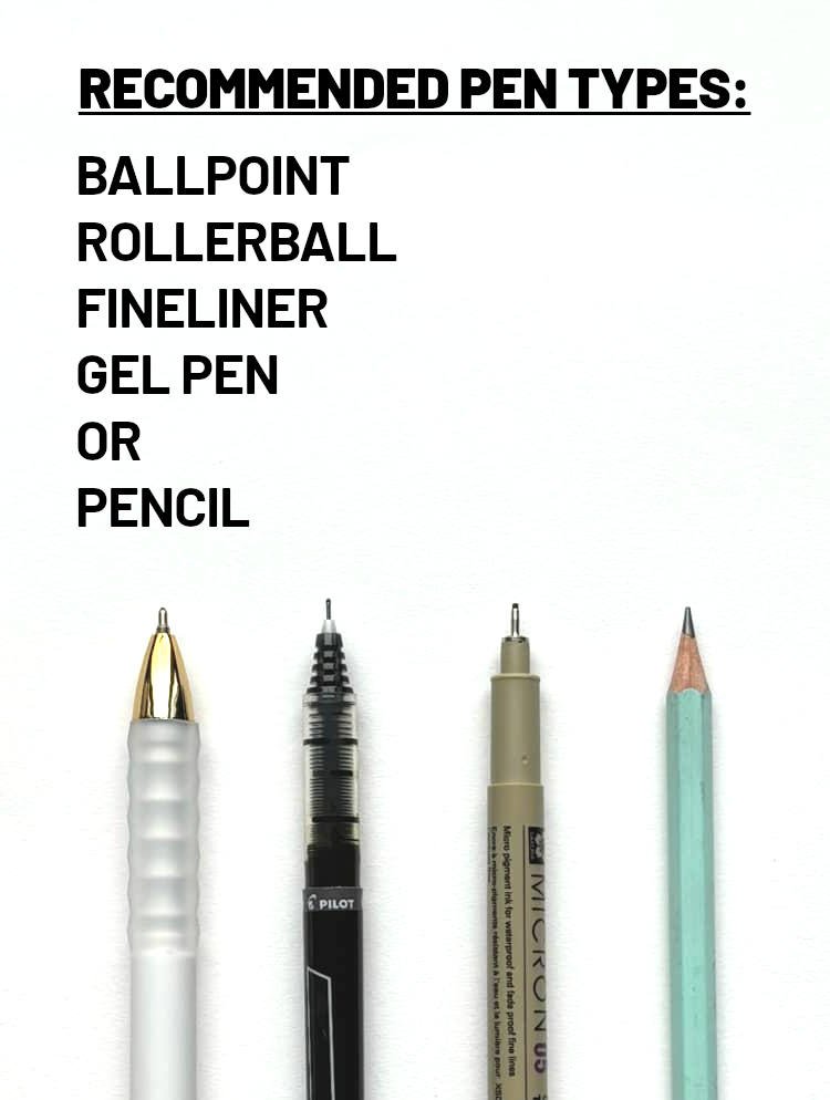
Here's a quick list of recommended pen types of lettering faux calligraphy:
Ballpoint pen
Rollerball pen
Fineliner pen
Gel pen
Pencil
If you’re just looking to try your hand at faux calligraphy to see if you like it, grab any pen you have lying around the house. A regular ballpoint pen or even a pencil will be just fine to begin. If you find you like lettering faux (and monoline), you can always upgrade your pen choice.
If you’re serious about learning faux calligraphy and want to achieve true proficiency, a rollerball or fineliner pen is recommended. You could call it an investment, but the cost isn’t much higher than a regular pack of ballpoints or gel pens. The two recommended from Heinen Designs are:
The Pilot Precise V5 pens are rollerball pens, so the ink has less of a gelled feel to it, unlike most ballpoint pens. This allows for smooth, consistent lines with a bold amount of ink laid down in every stroke.
The Sakura Pigma Micron pen or just “Micron” is a slight upgrade from the office-supply feel of the Pilot to more of an art-supply feel. A Micron is a true artist’s tool. Micron pens are fineliners or fine-line pens, offering an intense black ink with archival quality. The nib of the Micron is a felt tip that leaves a thin, consistent stroke every time.
How to Make Faux Letters
The key to making faux letters is to know where your downstrokes are. As we’ve already stated, faux calligraphy is a monoline alphabet posing as brush lettering. Every faux letter starts as a monoline letter. If you know which strokes in the letter are downstrokes, you can easily turn it into a faux letter.
It’s worth noting that because of this principle, virtually any monoline letter could be turned into a faux letter. Pick a monoline font – tall and thin, stretchy, neat and clean – any of these fonts can be transformed into a faux-style font simply by adding an extra line to the downstrokes.
If you’re not familiar with the different stroke types, hop over to our complete guide on the eight basic strokes of calligraphy.
Step 1: Write Your Monoline Letter
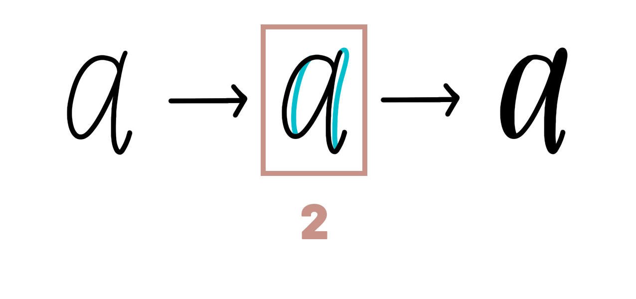
Let’s use the lowercase letter a as our example. To write the monoline a, start with an oval. Make the line in a counterclockwise motion, completing the oval at the top where you started. Next, make an underturn stroke to the right of the oval. Start high and bring the underturn all the down below the bottom of the oval, curling it around to the right at the end.
Step 2: Add Extra Strokes to Each Downstroke
This step is the key to faux calligraphy. To transform your lowercase monoline a into a faux a, start with the oval and add an extra stroke to the inner, right-side edge. Have the extra stroke meet the bottom of the oval about in the middle. This should form a little elongated bubble or open space at the start of your a. Now, do the same thing to the tall leg of the underturn stroke. It’s important to round off the top and bring the extra stroke to the middle of the underturn at the bottom. You should have two elongated bubbles when you’re finished.
Which Strokes Get Extra Strokes?
If you’re not aware, there are only eight basic strokes in modern calligraphy: upstroke, downstroke, overturn, underturn, ascending loop, descending loop, compound curve, and oval. The eight are used to form virtually every letter in the alphabet and every word you could possibly write. If you were to boil these eight strokes down even further, you could in theory turn everything into either an upstroke or a downstroke.
This is helpful to understand because faux calligraphy takes advantage of the downstrokes. If we know which strokes contain downstrokes, we can have a better grasp of where those extra faux strokes will appear.
So, which strokes have downstrokes?
Upstroke:
None
Downstroke:
All downstrokes will have an extra stroke.
Overturn:
The first part of the line will not have an extra stroke, but the second always will.
Underturn:
The first part of the line will always have an extra stroke, but the second never will.
Ascending Loop:
The curl at the top won’t have an extra stroke, until it turns into a downstroke.
Descending Loop:
The downstroke at the beginning will have an extra stroke until it curls around at the bottom.
Compound Curve:
Either the beginning and ending won’t have extra strokes, but the middle will, or the beginning and the ending will have extra strokes and the middle won’t. It all depends on whether the compound curve starts with an upstroke or a downstroke. Sometimes the middle will be horizontal enough that it won’t require any extra strokes at all.
Oval
One side of the oval will have an extra stroke, but the other won’t. Which side depends on whether the oval turns clockwise or counterclockwise.
Step 3: Fill in the Open Spaces
With both of your extra downstrokes added, it’s time to fill in the open spaces or bubbles. This is where the versatility of faux calligraphy really shines through. In fact, leaving the bubbles open as-is is a perfectly acceptable and even preferred option by some! You can also choose to color in the open spaces with your pen so that they’re solid black. This will give you the brush-lettered look. Alternatively, you can fill the open spaces with your choice of decorations – anything from polka dots, to snow flakes, to stars, to angled lines, to other colors. The choice is yours, so make it your own!
How Much Space is Too Much or Too Little?
As you go about crafting your faux letters, you may quickly ask the question, how much open space should my letters have? That is, how thick should the faux downstrokes be? The ideal amount of open space your faux letters should have depends on the size of the font and your plans for the finished piece.
If you’ve going for the true faux calligraphy look – faux letters that look just like real brush letters – then picture your downstrokes as true brush strokes. On a typical 8-1/2” x 11” sheet of paper this means around 1/8” thick at their thickest. You can vary this as desired to achieve different tones and effects, depending on the purpose of the piece: thinner faux strokes can be more elegant and a traditional calligraphy feel, while thicker can offer a more bold and stylized twist.
If you plan to fill your faux downstrokes with a pattern (lines, dots, shapes – see the complete list below), you may want to err on the side of thicker. Making the open spaces extra wide will give you room to add a meaningful pattern, especially if you’re working with more complex shapes, such as mini trees or stars.
The bottom line is, when it comes to open spaces or bubbles on your faux letters, there really isn’t a wrong way. Play around with different amounts of space and see what you like best.
Adding Fill Patterns to Your Faux Letters
Faux calligraphy is one of the most unique lettering styles. Sometimes the letters look like brush letters, other times they’re light and airy, and other times they look like a beautiful quilt, decorated with little charms and patterns from the season.
The reason faux can take on so many different personalities is because of its open spaces or bubbles within the letters. Almost every stroke in the faux alphabet has an open space built in, and this space can be filled in with the essence of your choosing.
Solid black
Filling your faux calligraphy bubbles in with solid black is certainly considered the classic look. Afterall, the faux alphabet was invented to mimic the look of brush lettering, and that’s exactly what the solid black look does. Filling in the gaps is also a handy way to cover up little mistakes and unwanted deviations in your letters. The extra stroke allows you to smooth out the lines and curves if that’s your desired look. Just remember to take your time to “color inside the lines.” There’s no rush – this is art!
Open space
A close second to the popular solid black look is to leave your extra faux downstrokes completely open. That’s right. Add your secondary lines and you’re done. This creates a really pretty alternative brush-letter look that’s light and airy. Unlike the solid black option, leaving your faux downstrokes open means there’s less room for error – you won’t be able to cover mistakes by filling them in with ink. It’s also worth noting that the open-space look can be modified in several ways to achieve different effects, such as making the extra downstrokes bold while leaving the primary stroke thinner.
Lines
Lines are another popular fill choice for faux calligraphers. The key to making a great lined pattern in your faux letters is consistency. You want all the lines going the same direction as if the little bubbles in your letters are windows into a lined background. Usually perfectly vertical or horizontal lines don’t work well for faux. Making the lines diagonal works better for the positioning of the downstrokes, and it allows you to produce a high-quality look without having to worry about making everything perfectly straight. You can do lots of thin lines, fewer thicker lines, a variation of thick and thin lines, and even crosshatching, making lines in two perpendicular directions.
Dots
Dots are a wonderful way to decorate your faux lettering. Adding a series of dots inside the open spaces can give your letters a festive or whimsical look, depending how big you make the dots. You can do pinpoints to mimic the look of falling snow or large polka dots to add a playful texture. You can do densely populated dots – lots of them all over – or you can scatter them more sparsely. Circles are a cousin to the dotted look and open up more possibilities, such as overlapping the circles for a bubbly appearance. One note of caution with dots: varying the size of the dots inside your open spaces can make a dalmatian look, and too many pinpoints can make a protoplasm look. That’s right, like a cell from a biology book. Of course, if that’s the look you’re going for or given the right context, maybe that effect is exactly right!
Decorations
The sky is the limit for adding shapes and decorations to your faux lettering. You can fill the open downstrokes with tiny flowers or trees. Make them pine trees for a Christmas piece. You can add stars or asterisks for a twinkling look. You could add triangles or squares or any number of geometric shapes or symbols. You could add waves, curlicues, ribbons. You could add crosses or fish if you’re lettering a bible verse. You could add little widgets, icons, or logos from a popular movie or book series. There really is no limit to the kinds of decorations you can add to faux calligraphy. Just remember, you only have so much room, so sometimes less is more.
Other colors
As an alternative to the solid black ink (or graphite!) look, you also have the option to fill in your faux bubbles with other colors. Once you’ve done the black monoline strokes and extra secondary downstrokes, you can choose another color of ink or pencil lead to fill in the open spaces. Blue, red, yellow, green, pink, orange – mix and match different colors for each letter or blend colors into one another in the same letter. This allows you to make every effect from sunsets and rainbows, to 80s rock, patriotic themes, flames, and so much more.
Gradients
A gradient is when one color fades into another, and typically the fade is from a light to a dark or vice versa. In faux calligraphy, you can fill in your open downstrokes with a variety of gradients to create dramatic effects. You can make the bottom of the letters appear lighter and fade to black as you move toward the top. You can also flip it, so the top is light and the bottom is dark. This gradient effect can be achieved in many different ways. You can use your diagonal lines, making them dense at the top but thinning them out as you move downward. You can use other colors of ink. You can use dots or decorations. The gradient can also start in the middle of the letters and move outward. It could start at the beginning of a word and fade as it moves toward the end. Whatever gradient you choose, just remember to be consistent and carry the effect across the entirety of your word or words.
Things to Avoid When Making Faux Letters
Like any hand-lettering alphabet, there are always things you should try to avoid when it comes to faux calligraphy. Some of these you’ll quickly discover on your own as you practice and make mistakes. Mistakes are okay! As long as you take time to understand them and learn from them, mistakes are a valuable part of becoming a better calligrapher.
Avoid “Pinch Points” in Your Faux Letters
When lettering faux calligraphy, you want to avoid making your letters and strokes too close together; that is, causing “pinch points.” It’s important to craft each character with the whole in mind. If your primary strokes are too close together and you go in to add your secondary strokes, things start to touch and overlap too much. This can evoke a cluttered feeling and distort the overall look of the piece. Give your letters ample spacing and work with the final piece in mind.
Avoid Guessing on the Downstrokes
Pay attention to the downstrokes so you don’t add an extra stroke to an upstroke by accident. One of the pitfalls of faux calligraphy is thinking that it’s a close cousin to drop-shadow lettering. But as we’ve already discussed, the two styles are built on very different principles. Avoid making guesses about where the downstrokes should be in your letters. To do this, it’s helpful to study your brush-lettering alphabet. It also helps to practice with faux worksheets that include help lines.
Avoid Adding Extra Strokes Too Soon
Don’t add the extra stroke right after each stroke or even after each letter in a word. As you craft your faux calligraphy, you’ll be making the bones of your letters with monoline. Instead of pausing after each stroke to make that secondary faux stroke, add all of the extra strokes at the end when you can see the whole word or phrase and take all the spacing into account. It’s also good to avoid filling in the open spaces too soon. Wait until the end, and you’ll have the most consistency.
Avoid Adding Sharp Points to Your Downstrokes
You need to think of your faux letters in the context of brush-lettering. It’s about mimicking the thick-to-thin technique. For that reason, the tops of your downstrokes – the ones that you’re adding the extra, secondary strokes to – they should be rounded, not pointy. A brush pen nib lays down a thick line as it’s pressed into the page to start a downstroke. As the pen is drawn downward, that line may thin out slightly, but it is still thick and rounded off at the top. In faux, there is absolutely room for stylistic creativity – 100% – meaning if you want to play around with pointed-top downstrokes you can. But, just remember to be consistent.
Avoid Over-Stroking Your Faux Letters
When you go to add your secondary strokes to your faux letters, don’t carry the extra lines too far into the horizontal portion of the original stroke. This is called over-stroking. It happens when the extra faux strokes start too early or end too late. The temptation is to push the faux effect too strongly by carrying the extra stroke around into the bottom of an underturn or descending loop, or to give it a generous start at the top of an overturn or compound curve. When it comes to faux, less is more!
If you’re interested in learning more about underturns, descending loops, compound curves, and more, check out our guide to the eight basic strokes of calligraphy!
Avoid Over-Decorating Your Faux Letters
Don’t over-decorate the open spaces of your faux letters. As we discussed above, there are countless decorations you can add to the open spaces of your faux calligraphy, but the saying is true here as well: less is more. This applies not only to the number of little shapes and patterns you add, but also to the complexity of those shapes and patterns. Adding too much in too small of a space will overwhelm you as the artist and take away from the overall quality of your piece. And that space is small! Remember, faux letters don’t provide a canvas; it’s more like tiny windows too peek through, so keep that space simple.
Avoid Inconsistency in Your Faux Letters
As is true with any calligraphy alphabet, inconsistency is the bane of faux hand-lettering. Avoiding some of the mistakes above will help you stay consistent, but it’s also important to maintain consistent spacing, height, stoke thickness, and style. Consistency should be carried across each letter and across full words. With faux, you also need to consider consistency in your fill choices. Choose one thing to fill your faux bubbles with and stick with it, at least throughout a word or phrase grouped together. If you fill in a few letters all-black, add polka dots to a few more, and color in rainbows in a third bunch, you can imagine how discombobulated the final effect will be.
Avoid Hastily Making Your Faux Letters
Also true for any calligraphy alphabet, faux letters shouldn’t be rushed. Don’t let the feeling of haste control your artistic output. It’s art! You’re not scribbling notes in a college class or jotting down a grocery list. Don’t make quick strokes. Don’t make quick secondary strokes. Don’t race to fill in the open spaces. Slow down, and enjoy the process. It’s art. Envision the final piece, and take pauses throughout your work to keep that piece in view. Put intentionality behind each stroke. It’s art, and you’re an artist.
The Entire Faux Calligraphy Alphabet Stroke by Stroke
If you want to master the faux calligraphy alphabet, it’s important to know the strokes that make up each letter and how those strokes intersect with one another. In this section, we’ll walk you through how to write the entire faux alphabet letter by letter, stroke by stroke.
Tap to jump to a specific letter
A | B | C | D | E | F | G | H | I | J | K | L | M | N | O | P | Q | R | S | T | U | V | W | X | Y | Z
Uppercase Faux A
Upstroke + descending loop + 1 extra downstroke
To make an uppercase faux letter A, start on the baseline and make a simple upstroke up to the capital height. Then, make a descending loop, dropping the stroke all the way down below the baseline, looping around counterclockwise, and curving back to intersect both vertical lines. End with a tail off to the left. Finally, add a single extra downstroke to the vertical line of the descending loop on the right-side edge.
Lowercase Faux a
Oval + underturn + 2 extra downstrokes
The lowercase faux letter a starts just below the X-height. Moving in a counterclockwise motion, make an oval, touching the baseline and ending at the X-height line. Then, along the right edge of the oval, make an underturn stroke, finishing with a shorter tail. Finally, make an extra downstroke along the inner left side of the oval and another to the right of the underturn’s downward leg.
Uppercase Faux B
Downstroke + ascending loop + descending loop + 3 extra downstrokes
The uppercase faux letter B starts at the capital height. Make a simple downstroke to the baseline. Then, make an ascending loop that extends all the way back up to the capital height, loops around clockwise, and ends by touching the vertical leg once again about halfway between the baseline and X-height. Next, make a descending loop, starting horizontally toward the right and loop down to just above the descender line. Continue in a clockwise rotation and trail the tail off to the right, intersecting the lower loop a little above the baseline. Finally, make the letter B faux by adding three extra downstrokes. There should be one along the initial downstroke, on its left-side edge. There should be another along the inside edge of the downstroke on the ascending loop. The third should be along the inside edge of the downstroke of the descending loop.
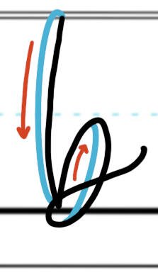
Lowercase Faux b
Ascending loop + oval + compound curve + 2 extra downstrokes
The lowercase faux letter b starts two-thirds of the way up to the X-height. Make an ascending loop, touching the capital height and dropping down to the baseline. Next, make a clockwise oval, about the height of the X-height. Finish the primary stroking with a compound curve flourish off to the right. Then, add the extra downstrokes along the inside edge of the ascending loop and on the inner, right-side edge of the oval.
Uppercase Faux C
Oval (open) + 1 extra downstroke
Start the uppercase faux letter C just below the capital height. Moving counterclockwise, brush the capital height and curve downward. Bring the line all the way to the baseline and back up again, ending about halfway between the baseline and X-height. Add the extra faux stroke along the right side of the open oval, along its inside edge.
Lowercase Faux c
Oval (open) + 1 extra downstroke
For the lowercase faux letter c, simple make an open oval, starting a little below the X-height and moving in a counterclockwise rotation. To turn it from monoline to faux, add one extra downstroke along the inside, left edge.
Uppercase Faux D
Downstroke + upstroke + descending loop + 2 extra downstrokes
To make the uppercase faux letter D, start with a simple downstroke that extends from the capital height to the baseline. Next, make an upstroke going all the way back up to the capital height and curving to the right. Then, make a descending loop, arching slight upward before dropping all the way down below the baseline, curling clockwise, intersecting all three vertical lines, and concluding with a tail off to the right. Add one extra faux stroke to the very first downstroke, on its left-side edge, as well as to the descending loop’s vertical downstroke, along its inside edge.
Lowercase Faux d
Oval + ascending loop + 2 extra downstrokes
To make the lowercase faux letter d, start just below the X-height, making a counterclockwise oval. After closing the oval, move your pen to the right to start the ascending loop. The loop should move counterclockwise as well, and should brush the capital height and dip below the baseline. Finish the letter by adding two extra downstrokes, one on the inner left-side edge of the oval, and one along the vertical height of the ascending loop.
Uppercase Faux E
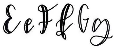
Oval (half) + oval (open) + 2 extra downstrokes
Start the faux capital letter E just below the capital height. Begin with an oval stroke that wraps counterclockwise, touches the capital height, and remains open, ending at the X-height. Then, make another oval, this one also rotating counterclockwise, touching the baseline, and also remaining open, trailing off rightward and almost touching the X-height. Finish by adding two extra faux strokes along the left side of the letter, each along the inside edge of the two ovals.
Lowercase Faux e
Ascending loop + 1 extra downstroke
To make a lowercase faux letter e, start halfway between the baseline and X-height. Make an ascending loop moving counterclockwise, touching the X-height, as well as the baseline. Finish with one extra downstroke along the inside edge of the vertical height of the loop.
Uppercase Faux F
Ascending loop + compound curve + 1 extra downstroke
The uppercase faux letter F is mostly an elaborate ascending loop. It begins at the capital height and moves to the left to form a somewhat tight, clockwise curl. The loop closes as the line drops down, descending to the baseline where it curls slightly to the left. To finish the letter, cross the middle with a shallow compound curve, just below the X-height, and then add an extra faux downstroke to the vertical leg of the ascending loop.
Lowercase Faux f
Ascending loop + descending loop + 1 extra downstroke
The lowercase faux f is made of two complicated strokes. Start with an ascending loop that begins halfway up to the X-height, loops around counterclockwise, touches the capital height, dips down below the baseline and curls upward. Move immediately into the descending loop, curving the stroke backward and making a small counterclockwise curlicue that rests on top of the baseline. Conclude your primary strokes with the tail trailing off to the right. The intersection should look like a tiny knot. Finish your faux letter with the extra downstroke along the inside edge of the ascending loop, spanning the full vertical height.
Uppercase Faux G
Oval (open) + underturn + 1 extra downstroke
To make an uppercase faux letter G, make a counterclockwise oval that begins just below the capital height. Bring the oval down to the baseline and back up to the X-height, leaving the circuit open. Then, make a shallow underturn that extends rightward, a little over half the width of the oval. Finish the letter with a single faux downstroke on the left side of the oval, along the inner edge.
Lowercase Faux g
Oval + descending loop + 2 extra downstrokes
Start the lowercase faux letter g just below the X-height, making a counterclockwise oval. As you round the last leg of the oval, straighten out in anticipation of the descending loop. Curl around clockwise, just tickling the X-height line. Bring your pen down, continuing in a clockwise rotation and letting the curl touch the descender line. Finish the stroke with a slightly curled tail trailing off to the right. For the extra faux downstrokes, make one along the inside, left edge of the oval and another along the inside, right edge of the descending loop.
Uppercase Faux H
Descending loop + ascending loop + 2 extra downstrokes
Begin the uppercase faux letter H at the capital height, making a descending loop that dips down below the baseline, loops around clockwise, and starts up again toward the right. As the line trails rightward, shift into the ascending loop, now rotating counterclockwise as you brush past the capital height. Bring the loop around and down again, intersecting just below the X-height. Finish just above the descender line with a slight underturn rightward. To make the H faux, add two extra downstrokes, one to the initial downward leg of the descending loop and another to the downward leg of the ascending loop.
Lowercase Faux h
Ascending loop + compound curve + 2 extra downstrokes
To make a lowercase faux letter h, start at half the X-height. Make an ascending loop that wraps counterclockwise, touches the capital height, and ends at the baseline. Then, make a healthy compound curve, starting upward, then downward, and finishing with an upward stroke. The second curve should dip below the baseline. To finish the faux h, add an extra downstroke along the vertical length of the ascending loop, inside edge. Make another downstroke along the downward stroke of the compound curve.
Uppercase Faux I
Underturn + ascending loop + 2 extra downstrokes
Start the uppercase faux letter I around the X-height line, making a small, shallow underturn to the left. Then, make a large ascending loop by swooping down to the baseline and curving counterclockwise up to the capital height. Continue to curve around, dropping the line down all the way to the descender line. Bring the curve upward once more, trailing off to the right and ending about halfway up to the X-height. Add two extra faux downstrokes, one to the first leg of the ascending loop, following the right-side edge, and the second to the long vertical segment of the loop, along its inner edge.
Lowercase Faux i
Underturn + dot + 1 extra downstroke
To make a lowercase faux letter i, start at the X-height and make an underturn that touches the baseline and finishes with a short tail off to the right. Place a dot above the starting point. Then, finish with an extra downstroke along the right side of the underturn.
Uppercase Faux J
Descending loop + 1 extra downstroke
The faux capital letter J is an elaborate descending loop. Start at the capital height line. Drop down to the descender line, curving clockwise. Loop around, rising up above the baseline once more and intersecting about halfway to the X-height. Finish with a trailing tail to the right. Add your faux downstroke to the initial downstroke segment of the descending loop.
Lowercase Faux j
Descending loop + dot + 1 extra stroke
To make a lowercase faux letter j, start at the X-height. Make a descending loop that curls clockwise and just brushes the descender line. Finish the stroke with a tail that trails off to the right. Place a dot above the line where you started. To make it a faux j, add the extra downstroke along the left side of the descending loop, along its vertical length.
Uppercase Faux K
Downstroke + descending loop + 2 extra downstrokes
Start the uppercase faux letter K by making a simple downstroke from capital height down to the baseline. Then, begin again at the capital height to make a descending loop. Curve the line gently clockwise and intersect the first downstroke about halfway between the baseline and X-height. Make a tight loop to the left of the first downstroke, continuing clockwise and intersecting the line again. End with a trailing tail off to the right without touching the baseline. Add two extra faux strokes, one along the right-side edge of the first downstroke and another along the right-side edge of the first segment on the descending loop.
Lowercase Faux k
Downstroke + descending loop + 2 extra downstroke
To make a lowercase faux letter k, start at the capital height and make a simple downstroke, bowing it slightly leftward. Then, starting at the X-height, make a descending loop, curling it clockwise and forming the intersection about halfway down the X-height. Finish with a short tail off to the right. To make it a faux k, add one extra downstroke to the primary downstroke, along its right-side edge, as well as another to the upper leg of the descending loop, along its right-side edge.
Uppercase Faux L
Ascending loop + descending loop + 1 extra downstroke
The faux letter L is an elegant combination of an ascending and then descending loop. Start just about the X-height. Move to the right, curving slightly upward and then begin a counterclockwise rotation to the form the ascending loop. Touch the capital height and then bring the line down, shifting into a descending loop. Curve the line clockwise, letting the loop pass through the baseline. Continue to wrap around, intersecting the downward stroke and ending with a slightly curled tail off to the right. Add one extra faux stroke along the vertical segment, on its right-side edge.
Lowercase Faux l
Ascending loop + underturn + 1 extra downstroke
The lowercase faux l starts about halfway up to the X-height. Begin the ascending loop, moving up toward the capital height and curving in a counterclockwise path. Bring the loop down and intersect at about the X-height. In the vertical descent, shift into an underturn stroke, touching or dipping slightly below the baseline. Finish with a generous tail off to the right. To add the faux effect, add an extra downstroke along the inside edge of the vertical stroke, from capital height to baseline.
Uppercase Faux M
Downstroke + overturn + compound curve + 3 extra downstrokes
Start the uppercase faux letter M at the capital height, making a simple downstroke to the baseline. Next, make an overturn stroke, leaping back up to the capital height and curving down again to about halfway between the baseline and X-height. Finally, make a compound curve, leaping above the X-height, dipping down below the baseline, and popping up once more, almost to the X-height. Then, add your faux downstrokes. One should be along the left-side edge of the first downstroke. Another should be along the downward stroke of the overturn, on its inside edge. The third one should be along the downward stroke of the compound curve, along its left-side edge.
Lowercase Faux m
Downstroke + overturn + compound curve + 3 extra downstrokes
The lowercase faux letter m is made almost the exact same way as its uppercase counterpart. Start at the X-height and make a downstroke to the baseline. Next, make an overturn stroke, reaching up to the X-height and again down to the baseline. Finally, make a compound curve that reaches again to the X-height, dips below the baseline, and finishes with a tail off to the right. Add faux downstrokes to the first downstroke on its left side, to the downstroke of the overturn on its left side, and to the downstroke of the compound curve on its left side.
Uppercase Faux N
Downstroke + compound curve + 2 extra downstrokes
Start the uppercase faux letter N by making a downstroke from capital height down to the baseline. Next, make a compound curve, popping all the way back up to the capital height, curving around and down again, passing under the baseline. End with a tail that courses back up toward the X-height, trailing right. To make it a faux letter, add two extra strokes. One should be along the left-side edge of the initial downstroke. The second should be along the downward stroke of the compound curve, along its inside edge.
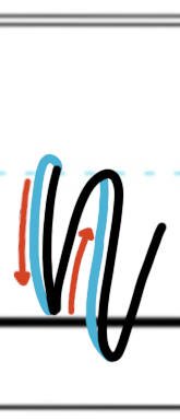
Lowercase Faux n
Downstroke + compound curve + 2 extra downstrokes
To make a faux letter n, begin at the X-height and make a downstroke to the baseline. Next, make a compound curve stroke, reaching up to the X-height and dipping down below the baseline. Finish with a trailing tail off to the right. Add faux downstrokes to the initial downstroke on its left side, and to the compound curve’s downstroke on its left side.
Uppercase Faux O
Oval + 1 extra downstroke
The uppercase faux letter O is as simple as the most basic oval stroke. Start at the capital height and move counterclockwise. Make a tall, uniform oval that extends from the capital height, down to the baseline, and back up again to the capital height. Add the extra faux stroke along the inside, left edge.
Lowercase Faux o
Underturn + ascending loop + 2 extra downstrokes
The lowercase faux o can be thought of as a modified oval stroke or as a combination of an underturn and an ascending loop. To make the faux letter o, start just below the X-height and make an underturn stroke that touches the baseline and curves around in a counterclockwise path. On the upstroke of the turn, shift to the ascending loop stroke, bringing the line up to the X-height again and curving around to pass through the initial line, just below the starting point. Conclude with a short tail off to the right. Add two small downstrokes to make it a faux letter, one to the initial downstroke and another to the downstroke of the loop, on its inside edge.
Uppercase Faux P
Downstroke + ascending loop + compound curve + 2 extra downstrokes
Start the uppercase faux letter P by making a basic downstroke from capital height to the baseline. Then, start into the ascending loop, moving up to the baseline and curving clockwise. Loop around and intersect the two vertical lines below the X-height, about halfway between the X-height and baseline. Continue to loop around clockwise, making a tight curl that passes back through the vertical lines, just below the X-height. End with the line trailing off to the right. Add your two extra faux strokes next. One should be on the left-side edge of the initial downstroke. The other should be on the inside edge of the ascending loop.
Lowercase Faux p
Downstroke + ascending loop + compound curve + 2 extra downstrokes
To make a lowercase faux letter p, start at the X-height and make a downstroke to the descender line. Next, start the ascending loop, bringing the line up to X-height once more before curving around clockwise and intersecting just below the baseline. Finish with a compound curve that curls up through both the initial downstroke and loop and trails off to the right. Make two faux downstrokes, one along the left-side edge of the first downstroke and another along the inside edge of the loop.
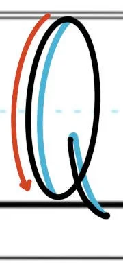
Uppercase Faux Q
Oval + downstroke + 2 extra downstrokes
Start the uppercase faux letter Q by making a simple oval. Begin at the capital height and rotate counterclockwise. The oval should touch the baseline and come all the way back up to the capital height. Then, make a gently curving downstroke through the bottom right quadrant of the oval. Start about halfway between the baseline and X-height, and bring the line out and to the right, dipping below the baseline. Now, add two extra faux strokes. One should be along the left, inside edge of the oval. The other should be along the right-side edge of the downstroke.
Lowercase Faux q
Oval + descending loop + 2 extra downstrokes
To make a lowercase faux letter q, start just below the X-height and make a counterclockwise oval, reaching down to the baseline and up again to the X-height. Next, make a descending loop, dipping down below the descender line and making a tight counterclockwise curl. Add two extra downstrokes for the faux effect, one to the inner, left-side edge of the oval and another to the right-side edge of the descending loop.
Uppercase Faux R
Downstroke + ascending loop + descending loop + 2 extra downstrokes
Start the uppercase faux letter R at the capital height, making a downstroke to the baseline. Next, move into an ascending loop, bringing the line all the way up to the capital height again and curving around clockwise. Bring the loop down and around, intersecting the downstroke about halfway between the baseline and X-height. Continue clockwise, shifting into a descending loop. Make a small loop to the left of the downstroke and pass again through the initial downstroke. End with a trailing tail off to the right that dips below the baseline. Then, add two extra faux strokes. Add one to the left-side edge of the initial downstroke and another to the inside edge of the ascending loop.
Lowercase Faux r
Ascending loop + underturn + 2 extra downstrokes
To make the lowercase faux letter r, start an ascending loop at the baseline, bringing the line up above the X-height and making a tight loop that rests atop the X-height. Then, make an underturn, dipping the turn down below the baseline and trailing off to the right. Add an extra downstroke to the inside edge of the loop, as well as the to the first stroke of the underturn.
Uppercase Faux S
Overturn + descending loop + 1 extra downstroke
The uppercase faux letter S begins just below the capital height. Make a slight overturn, moving counterclockwise. As you curve downward, shift into a descending loop. Bring the stroke down to the baseline, rotating clockwise this time. Continue to loop around, intersecting the vertical line and moving back up toward the X-height. Finish with a tail off to the right. Then, add a single extra faux downstroke along the right-side edge of the descending loop, along the vertical segment.
Lowercase Faux s
Overturn + descending loop + 1 extra downstroke
Start the lowercase faux letter s just below the X-height. Make your vertical compound curve, traveling counterclockwise first and then shifting to clockwise as you curl the stroke down toward the baseline. Halfway down, change the stroke to a descending loop. Dip below the baseline and curl around clockwise, finishing with a trailing tail off to the right. Add one extra faux downstroke that starts along the inside edge of the top curve, intersects the initial line, and finishes along the inside edge of the bottom curve.
Uppercase Faux T
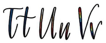
Underturn + compound curve + 1 extra downstroke
To make the uppercase faux letter T, begin at the capital height. Make an underturn stroke that drops down to the baseline, curves counterclockwise at the bottom, and comes back up again to just below the X-height. Then, make a shallow compound curve across the top of the underturn. To make it a faux letter, add a single, extra downstroke along the right-side edge of the underturn’s vertical segment.
Lowercase Faux t
Underturn + compound curve + 1 extra downstroke
The lowercase faux letter t is very similar to its uppercase counterpart. Start at the capital height. Make an underturn stroke that drops all the way down, dipping below the baseline but only reaching up about halfway to the X-height. Then, make a shallow compound curve that cross the first stroke about a quarter of the way between X-height and capital height. Finish with an extra downstroke along the right-side edge of the underturn’s vertical line.
Uppercase Faux U
Underturn + underturn + 2 extra downstrokes
The uppercase and lowercase faux letter U are very similar. To make the uppercase U, start at the capital height. Make an underturn that sweeps down to the baseline and curves back up to the capital height. Next, make another underturn, this time dropping down to the baseline but only coming back up about a third of the way between the baseline and X-height. Finally, add the two extra faux strokes, one to the right-side edge of the first underturn downstroke and the second to the right-side edge of the second underturn downstroke.
Lowercase Faux u
Underturn + underturn + 2 extra downstrokes
To make the lowercase faux letter u, start an underturn at the X-height. Bring the line down to the baseline and up again to the X-height. Then, make a second underturn stroke, dipping down below the baseline and ending only about hallway back up to the X-height. Conclude with two extra faux downstrokes, one on each of the first underturn segments, along the right-side edges.
Uppercase Faux V
Downstroke + overturn + 1 extra downstroke
Start the uppercase faux letter V at the capital height. Make an angled downstroke to the baseline. Then, make an exaggerated overturn stroke, moving back up to the capital height at the opposite angle and curling around above the capital height line. Finish with an extra faux downstroke along the right-side edge of the original downstroke.
Lowercase Faux v
Underturn + 2 extra downstrokes
Think of the lowercase faux letter v as a modified underturn. Start the underturn at the X-height, dropping the line down to the baseline and finishing it up above the X-height. Make a small clockwise curl at the end. Then, add your extra faux downstrokes. One will be along the first segment of the underturn, along its right-side edge. The other will be very small, accenting the modified curl at the end.
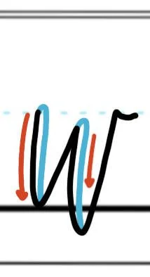
Uppercase Faux W
Underturn + underturn + 2 extra downstrokes
To make an uppercase faux letter W, start with an underturn that begins at the capital height. Bring the line down to the baseline, curving to the right. Bring it back up to the X-height and start into a second underturn. This time, dip below the baseline, curve around again to the right, and bring the stroke all the way back up to the capital height. To make the W a faux letter, add an extra stroke to the first, downward segment of each underturn, both on the right-side edges.
Lowercase Faux w
Underturn + underturn + 2 extra downstrokes
To make a lowercase faux letter w, start at the X-height and make an underturn that dips down to the baseline and ends about two-thirds of the way back up to the X-height. Make a second underturn that dips below the baseline and reaches all the way back up to the X-height. Modify the second underturn with a short tail that dips rightward. Finish the letter by adding the faux downstrokes to the starting leg of the first underturn, along the right-side edge, as well as to the first leg of the second underturn, also along its right-side edge.
Uppercase Faux X
Compound curve + upstroke + 1 extra downstroke
Both the upper and lowercase X are very similar. Start the uppercase faux X just beneath the capital height. Make a compound curve, sweeping up toward the capital height, then down to the baseline, and up again slightly. Next, cross the compound curve with an upstroke that extends from baseline to capital height. Lastly, make the extra faux downstroke along the left-side edge of the compound curve.
Lowercase Faux x
Compound curve + upstroke + 1 extra downstroke
To make a lowercase letter x in faux, start just below the X-height and make a compound curve, arching up to the X-height and dropping down to dip below the baseline before popping up again. Cross through the middle of the compound curve with a simple, angled upstroke from baseline to X-height. To make the letter faux, add an extra downstroke to the vertical leg of the compound curve, along its right-side edge.
Uppercase Faux Y
Underturn + descending loop + 2 extra downstroke
Begin the uppercase faux letter Y at the capital height, and make a large underturn stroke that dips below the X-height and comes back up again to the capital height. Shift to the descending loop, dropping the line swiftly downward and looping around clockwise, lettering the loop pass through the baseline. Continue to curve around, intersecting the vertical portion of the stroke above the baseline. End with a tail trailing off to the right. Now, make two extra downstrokes to make it faux. Add one to the first segment of the underturn, along the line’s right-side edge. Add the second to the vertical portion of the descending loop, along its left-side edge.
Lowercase Faux y
Underturn + descending loop + 2 extra downstrokes
To make the lowercase faux letter y, start at the X-height and make an underturn stroke, touching the baseline and bringing the returning upstroke to just above the X-height. Next, start into a descending loop, dropping down to the descender line as you curve clockwise. Continue to loop around, and intersect the vertical line below the baseline. Finish with a trailing tail off to the right. To make the letter y faux, add two extra downstrokes, one on the right-side edge of the underturn’s downward stroke and another on the long vertical stroke of the descending loop, on the inner, left side.
Uppercase Faux Z
Upstroke + downstroke + upstroke + 1 extra downstroke
Start your uppercase faux letter Z about halfway between the X-height and the capital height. Make a shallow-angled upstroke that travels to the right and ends at the capital height. Now, switch back the direction, making a downstroke to the left and down to the baseline. Finally, make another shallow upstroke, moving to the right and ending a little bit above the baseline. Add one extra faux stroke to the middle downstroke, along its right-side edge.
Lowercase Faux z
Overturn + overturn + descending loop + 2 extra downstrokes
To make a lowercase faux letter z, start about halfway up to the X-height. Make an overturn stroke, extending up to the X-height and down to the baseline. Next, make another overturn but shorter. Bring the line only up about a third of the way between the baseline and the X-height, and then curve down again toward the descender line. Shift the stroke into a descending loop. Wrap the loop clockwise as it touches the descender line. Intersect the vertical line halfway between the baseline and descender line, and end with tail off to the right. To make it faux, add extra strokes to the downstroke on the first overturn, along its right-side edge, as well as to the vertical downstroke of the descending loop, along the inside, left edge.
Start Your Faux Calligraphy Journey Today!
Start with this free downloadable worksheet to try your hand at faux calligraphy, and be sure to check out our beginner’s faux calligraphy workbook!


